Why presets, styles and filters just don’t work.

_DSF8243.jpg

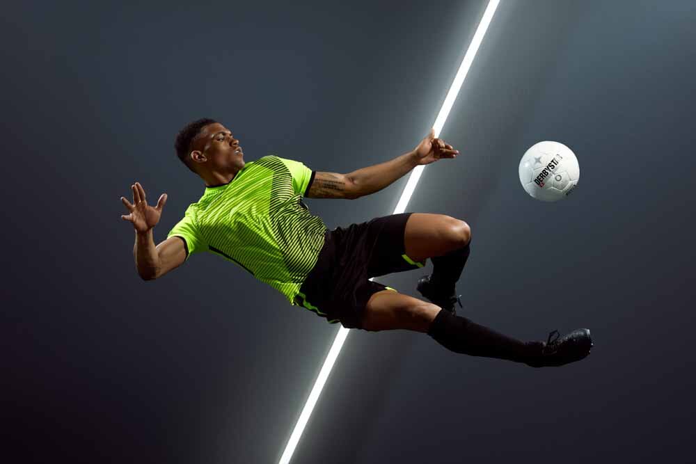
They look so convenient... 

When you are sitting in front of your computer, as a photographer or a retoucher, you are always trying to save time. Whenever you have the chance to automate tedious processes, you are more than willing to do it. That’s why everybody loves using keyboard shortcuts and Photoshop actions. 

Since color can be a pretty time consuming matter, wouldn't it be wonderful to automate this process as well? 

Adobe, Phase One, and third party creators advertise the use of presets like they are a true miracle: “Take your photo editing to the next level!”, “Create professional looks!”, “Speed up your workflow!”. 

Problem solved, right?

So why are lots of professionals still dissatisfied by their work when it comes to color? 

Roll the dice 

“Color is the most relative medium in art. Every perception of color is an illusion. In our perception they altern one another.”​ - Josef Albers 

There are certain things that we cannot just delegate to a piece of software yet. It is just too complex, especially if we hope to achieve repeatable and reliable results.

Using presets isn’t bad per se, but always relying on them can be very detrimental for three main reasons: 

  1. As a photographer, you are convincing yourself that color is something that needs to be addressed after the images have already been taken. 

  2. Images from the same set can potentially look very different since presets don’t take into account the variations that happen throughout a shoot (different light, different colors, different clothes, different elements in the background). 

  3. There is no thought process involved from your side. You are just rolling the dice, hoping that something interesting is going to happen. 
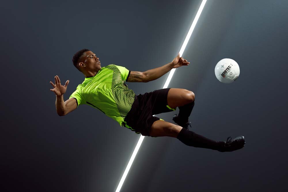
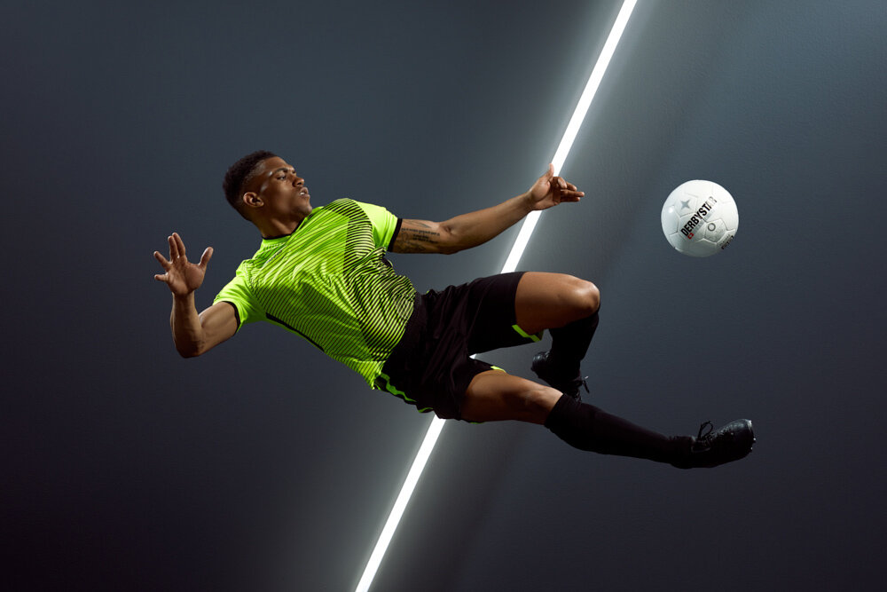
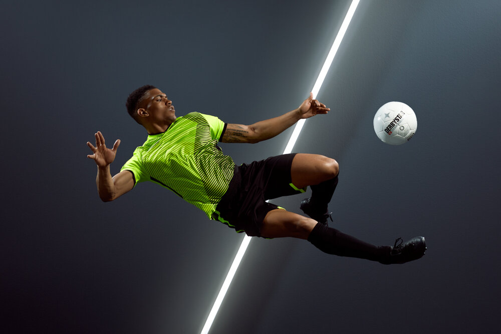
Example

Let’s assume that the look of image A has been achieved using a preset. Then the same adjustments have been used on image B that had been taken in the same venue but at a different time.

It’s pretty clear that the result is very different and, as they are now, image A and image B cannot work together nicely. If in image A it was perfectly fine to add warmth to a particular shade of blue/magenta, in image B the effect is just too much. Using the same “preset” just won’t work, that’s why image B requires a manual match using some masks and curves.

Learn from them instead 

Over time, the result of depending on these automations creates a compound effect that won’t allow you to grow.

I know it because this is what I did for a very long time. 

If you want to use presets, do it the smart way.

Use them as a tool to study color theory.

If something looks very nice with a specific preset, try to understand why. Which element has been influenced the most by the preset? The overall contrast? A specific color? Which color harmony is it creating? 

Books you should read 

If you are interested, I wrote a guest post on Mareike Keicher’s blog a while ago. I listed the best books for photographers and retouchers that I have read. The topics discussed in these books can be beneficial if you want to be more deliberate and confident when it comes to colors and visual arts in general. 

Remember to also check out her work on her website.


Weird colors and monitor accuracy.

monitors.jpg

What is a color model?

A color model is a system used to describe colors numerically and it allows us to express a fixed range of colors and luminosity values. Inside color models we have color spaces and they are commonly used to indicate the chromatic reproduction capabilities of digital images or devices such as cameras, monitors and printers.

The most relevant color models in photography are:

  • RGB (with color spaces like sRGB, Adobe RGB, ProPhoto...)

  • CMYK (with color spaces like Coated Fogra39, US Web Coated SWOP v2...)

  • Lab

Lab has two main advantages compared to the other two, as it contains all the colors that the human eye can perceive (even more) and it can unequivocally define a specific color with a unique Lab triple (e.g. L*63, a*13, b*50). The same does not happen if we talk about RGB or CMYK color models.

Why? It all comes down to...

Which RGB or CMYK color space are we talking about?

If we are working in an RGB environment we can surely define a color with an RGB triple but, depending on which color space we are using, the actual color can change. As you see here, the same RGB triple is defining three different colors.

The same happens if we are working in a CMYK environment. What color space are we talking about? Coated Fogra39 or US Coated (SWOP) v2? Maybe Coated Fogra27?

You can clearly see the advantages of Lab compared to the other color models. There is only one big problem, the technology used by our monitors, laptop and smartphone displays is still based on RGB, not Lab. This is why it is crucial for professional photographers and retouchers to have a correct color management workflow.

Why is color management so important?

Simply put, without a correct color management workflow, the risk of color reproduction inaccuracies is granted. Why am I so sure? Because of the endless number of technological and manufacturing differences between hardware, in particular, digital screens.

I want to reproduce this exact color (defined by a Lab triple) on two different monitors. In order to do so, my Eizo CS2730 and my Asus PB248Q have to use different RGB triples.

lab.jpg

Why? Because they have been built with different materials and technologies. The same happens with every screen. For instance, my smartphone has an OLED display but my Eizo has an IPS panel. They have inevitable construction differences and, for this reason, the same numerical RGB input results in a different output color. Colors can even vary between two monitors of the same model.

Every display speaks its own RGB “dialect”, and each one of them needs different “dictionaries” in order to do correct translations. This conversion process between RGB “dialects” is called monitor compensation.

What is monitor compensation?

In order to compensate for these inevitable variables, Photoshop’s Adobe Color Engine does not send the original RGB values to the video card (and then to the screen), but instead, it sends new converted values that are correct for that specific display. This is the only process that allows us to see the same color on two different monitors, as long as both monitors are actually capable of reproducing it (you will never get to see an Adobe RGB image with super saturated greens properly on a sRGB monitor).

In order to do a proper conversion, three conditions need to be satisfied:

  • The image must have its own color profile embedded (e.g. sRGB, Fogra39, Adobe RGB 1998...).

  • The display must have its own color profile (you have to calibrate your monitor).

  • The graphic software that you use to open the image, needs to be a color managed application. It needs to have a color engine that is aware of both the color profiles of your image and monitor. (e.g. Photoshop with ACE Adobe Color Engine)

This is why it is so important to regularly calibrate your monitor (i.e. create a custom color profile with a colorimeter), always embed the color profile to the images that you deliver and be aware of which software is used to open them.

Common issues

  • A client sees undersaturated colors on an Adobe RGB image.

    • Is the color profile embedded in the image? ❌

    • Does your client have a calibrated monitor? ✅

    • What application is he using to open the image? Photoshop. ✅

Since the Adobe RGB color profile was not embedded in the image, Photoshop does not know which “language” to use to read it. It may assign a different color profile like sRGB automatically. This is why it is always important to keep the “Ask when opening” option checked under “Profile Mismatch” and “Missing Profile” in Photoshop’s “Color Settings'' section.

  • A client sees a weird cyan dominant on an sRGB image.

    • Is the color profile embedded in the image? ✅

    • Does your client have a calibrated monitor? ❌

    • What application is he using to open the image? Photoshop. ✅

Most likely, he always sees a cyan dominant in everything. His graphic card is just reading the native RGB values of that image, and is sending them to the monitor without a proper conversion, since he didn’t create a custom color profile with a colorimeter. No correct monitor compensation has occurred and that cyan cast is due to the manufacturing peculiarities of that specific monitor.

  • A client sees muted colors on a CMYK Fogra39 image.

    • Is the color profile embedded in the image? ✅

    • Does your client have a calibrated monitor? ✅

    • What application is he using to open the image? Preview on MacOS. ❌

Preview on MacOS is not aware of the CMYK Fogra39 color profile, so it just assumes that it is a generic RGB color profile, so therefore we have color inaccuracy.

Conclusion

This topic can be pretty complex to understand, which is why I tried to simplify certain aspects, and I didn’t want to look further into technical details. If you want to mitigate and avoid color reproduction inaccuracies, be sure to implement a good color management workflow.

  • Invest in a good wide-gamut monitor and calibrate it regularly.

  • Always embed the color profile into the files that you deliver.

  • Always open your images with a color managed application that has the capability to recognise both your monitor’s color profile and your images’ color profile, like Photoshop.

How does JPG compression affect image quality?

Untitled-1.png

How does JPG compression work?

The goal of image compression is to reduce redundant data and to store or transmit images in a more efficient way. The concept behind it is to reduce the size as much as possible while retaining a similar appearance to the original image.

During the compression process, “raster” software like Lightroom, Photoshop or Capture One adopt algorithms that allow certain frequency components of the images to be thrown out. Consequently, the images will contain fewer bits than the original representations.

How does compression impact an image?

Depending on the software used, the result can vary significantly. For the following comparisons, we’ll analyze an image that contains both gradients (background) and fine details (subject, t-shirt, ball).

The source file is a 1000 x 667 px JPG that weights 431 KB.

Here are the export results after using Photoshop and Capture One.

1. Photoshop Compression Results

Untitled-1.jpg

Results:

  • Even if the file size has been reduced by half or even two-thirds, at 90 - 80 quality, the image looks almost identical to the original.

  • At 60 quality, we start to see artifacts around all edges and posterization effects on the background. Fine details become a bit blurry.

  • A quality level below 60 would be considered unusable. The file size has been greatly reduced, but the compromises are just too significant.

2. Capture One Compression Results

capture.jpg

Results:

  • At 90 - 80 quality, the file size has been reduced even further compared to Photoshop, and the appearance still looks very similar to the original.

  • At 40 quality, fine details become less sharp, and we start to see artifacts around all of the edges. The posterization effects are a lot less noticeable though.

  • Any quality level below 40 would not be considered worthwhile. The differences in terms of size are minimal, and artifact count is much more relevant.

  • At 1 quality, even though the image has become kind of blurry, the gradients have retained a lot more of their original smoothness in comparison to the Photoshop exports.

Final Observations

As we saw, Photoshop and Capture One algorithms rendered the image in a slightly different way. The file sizes are definitely comparable, but in terms of efficiency, Capture One has a noticeable edge when it comes to gradients. There are no significant differences though when it comes to artifact quality.

Is there a standard “quality setting” to use?

Yes and no.

The quality level that you should choose when exporting an image to JPG is highly dependent upon the kind of detail contained within the image. An image of a smooth blue sky with a large area of gradient would need a high quality setting such as 90 - 80. An image that only contains complex detail can easily get away with a quality setting of 60, and possibly even lower.

Both Photoshop and Capture One allow you to view a preview so you can check every time which is the best value to use in real-time.

If you do not want to play around with the preview option every time, using a quality setting of 80 would be the safest choice for the vast majority of cases, especially if you are exporting with Capture One.

Credits:
http://regex.info/blog/lightroom-goodies/jpeg-quality#example

Mastering Color Adjustment Levels + Exercise.

Untitled-1.png

Why is this important?

As we already know, color grading isn’t just applying a colored tint to the highlights and shadows of an image. In most cases, in order to create an effective color scheme, you’ll have to manipulate several elements inside the frame. It may be necessary to change the color of the subject’s shirt from red to blue or to shift the green of the grass towards a colder shade for instance.

Color grading cannot be defined as an exact science; the final result depends on the image you’re working on and your sensibility.

For this reason, knowing the theory is certainly useful, but without a practical understanding of the tools available, it can be really difficult to achieve good results.

If you can’t execute what you envision, the only thing you’ll ever experience will be frustration and disappointment.

How can you improve?

As with everything in life, repetition is the only way to get better at something. No secrets or unexpected revelations can match the power of endless repetition. No magic shortcut will ever give you what you can learn from dozens or hundreds of hours of work.

“Experience comes from good judgement, and good judgement often comes from bad judgement.” - Will Rogers

Now, you have to choose. You can wait and only try to implement what you learn when the opportunity arises, or you can be proactive about it, and decide by yourself when to exercise and improve.

Find some time and try to match the color harmony of a specific image. If you can’t reproduce the same color scheme due to the different elements inside the shots, just try to replicate just the mood. Change the color of the subject’s clothing using a “Curve,” modify the tint of a seamless using a “Selective Color” adjustment level, or try to shift the skin tone of the model to better fit the colors of their clothing.

You just need to experiment, but remember. and you must allow yourself to fail.

Practical exercise

DOWNLOAD: Color Matching Exercise + Video

One of the many things that I learned from Natalia Taffarel is this color-matching exercise. Just choose a random color as a source and then try to match it three times, first using a “Curve,” then a “Selective Color” adjustment layer, and finally, a “Hue/Saturation” adjustment level. Try to match five colors every day for three weeks as an exercise; you’ll notice a huge improvement in terms of speed and sensibility.

After you get the hang of it, try to match the source, starting from a color instead of white. 

If you have any questions, just send me a mail or a DM on Instagram!

Credits:
Natalia Taffarel -
Website


How to view your photos at actual print size in Photoshop.

joshua-fuller-I0ucRdvImTo-unsplash.jpg

Why do we need to do this?

The zoom tool in Photoshop is usually used to focus on small details or to look at an image in its entirety. Unfortunately, these options are not useful or accurate if we want to view the exact physical dimensions of an image before printing. This is where the Print Size view in Photoshop comes to our aid.​

It may seem trivial, but being able to see an image in its actual print dimensions (1:1 scale) is really beneficial for two reasons

  1. It gives a better understanding of how the image will be perceived. Our monitor will become a window that faithfully represent our prints size-wise.

  2. It allows us to see and review the effects of Sharpening and Grain at the right distance, since their effects are directly related to image size.

How can we do it?

1 - Tell Photoshop the resolution of your screen.

First of all, we need to let Photoshop know how many pixels the monitor can display in one linear inch (PPI), this way, it will be able to calculate the exact zoom level to use. You have to do this process just once.

Go to Edit > Preferences > Units and Rulers


If you don’t know the resolution of your screen, you have two options:

  1. You can find this information on the internet by searching Google for the model of your monitor followed by the word “PPI,” e.g., “Eizo CS2730 PPI.”

  2. You can calculate the resolution yourself. Just measure the width of your screen (e.g. 23.5 inches). Look at the native pixel dimension of your screen and write down the number of pixels on the horizontal axis (e.g. 2560 pixels). The final step is doing the math, dIvide the 2560 pixels/23.5 inches = 109 pixels/inches (PPI).

2. Assign a print dimension to your file.

Now that you have entered the correct resolution of your monitor into Photoshop, you need to assign specific print dimensions to your image. For instance, 20x30cm.

Go to  Image > Image Size


And that’s all! Anytime you want to view that image in its actual print size, just go to View > Print Size, and Photoshop will automatically adjust the zoom level. (From now on, 1 cm on your screen will correspond to 1 cm on paper).

Taste vs. Skills. This is why you quit.

cristian-newman-wGKCaRbElmk-unsplassh.jpg

Do you ever feel like quitting?

Does your creative mind keep telling you, "That’s not good enough?"

Six months ago, I decided to spend one entire week reworking some old photos. I wanted to test how much I had improved in the past couple of years, and whether or not I could create better color harmonies. I was really excited to “work” for myself again and test my knowledge.

After 8 hours, I quit, devastated by uninspiring results. I couldn’t produce anything that was up to my own expectations.

“Perfection” is just an ephemeral concept. I learned this a long time ago, you can only get close to it through endless repetition, but no matter how much experience you have, it is always a nerve-wracking process. I quit because of one simple reason: my taste had kept improving over the years, but my skills hadn’t developed at the same pace. The discovery of this gap put me in a bad mindset that forced me to give up.

This is the endless conflict that you constantly experience. This is why it’s always difficult to live up to your own tastes.

 
taste.jpg
 

Even though it can feel extremely discouraging, this is actually a good thing.

In the long run, being at odds with your own taste and high expectations is something that will set you apart from the competition. Surely, you’ve seen some artists whose work is technically good but which looks artistically lifeless to you. Their work is not intriguing or evocative, and it doesn’t draw you in. It doesn’t have that “special thing,” as Dainius Runkevicius perfectly says:

If you always like your work you should be concerned. Chances are you’ll end up as that poor guy on the Xfactor stage who can’t sing and has no idea why the crowd is booing him out. Taste is a unique fingerprint that can distinguish you from the rest.”

As a creative, your taste is probably your most relevant and meaningful expressive trait. Feeling awkward about your work just means that your taste is doing its critical and selective job.

It all comes down to accepting the struggle and embracing the negativity that comes from it. It’s when you overcome this feeling that you are able to create something that speaks to yourself and others. You’ll feel great about yourself just for trying, regardless of the actual results. You remain focused, positive, and curious regardless of this overwhelming sensation. Our tastes and skills will always be at war; in order to grow, we must find a way to make them coexist in a balanced way.

Do you still feel uncertain? Answer these questions:

How much time or how many chances would you give a one-year-old child before they should give up, silently accepting that they’ll never learn to walk? 6 months? 258 falls? After each fall, would you be supportive or discouraging?

If these questions sound crazy to you, why are you adopting the same toxic approach when judging your own efforts? How terrible would it be for a baby to learn how to walk under this unnecessary pressure? Why are you putting so much pressure on yourself for something that’s already meant to be difficult?

Next time you feel like quitting like me, take a deep breath. Remember to stay curious, to keep practicing, and to work on not constantly judging yourself for what you do. Your taste is actually on your side!

Sources:
Ira Glass. The Gap, https://vimeo.com/85040589

Sharpening and Grain? Resize first.

At what stage of your workflow do you sharpen or apply grain? Do you do it before or after you resize your images? 

Since sharpening and applying grain are strictly related to the actual dimension of an image, your timing significantly influences the final results. 

Why? 

Pixel interpolation happens every time you have to increase or decrease the total amount of pixels of an image, and every time you rearrange those pixels within the raster grid. This includes whenever you rotate an image, change its perspective, use the warp or liquify tool, etc.


The results of these processes can vary quite a lot, depending on the interpolation algorithm used.

If we talk about downscaling or upscaling, Photoshop allows for the use of different ones depending on the scope. We can choose between Preserve Detail, Bicubic Sharper, Bicubic Smoother, Nearest Neighbor, and Bilinear. It wouldn’t be entertaining to talk about the technical differences; you just need to know that each one of them operates in a slightly different way, and it fits a specific purpose (image enlargements, image reduction, smooth gradients, etc.). 

To allow these enlargements or reductions, the algorithms need to operate an approximation. They use known pixels to estimate the value of new pixels that didn’t exist before. For this reason, it’s quite common to perceive some sort of quality loss during the process

Here you have an example of an image enlargement and a reduction. 

 
Interpolation-enlargment.jpg
 
 
Interpolation-reduction.jpg
 

You can clearly see now that the more you stretch or shrink an image, the more pixels the algorithm needs to guess to create a new resampled version. 

The same estimation process occurs to your Sharpening or Grain application if you do it before resizing. The Sharpening values that you chose (% amount, pixel radius, level threshold) or the Grain characteristics that you selected (% amount, size, distribution) will inevitably be approximated by the algorithm, resulting in a significantly different outcome.  


In this example, you can easily see how the negative effect of the algorithm altered the appearance of the grain. After downsampling, it looks smudged and much less sharp. 

For these reasons, the best option would be to sharpen and add grain at the end of your workflow, right after resizing the images. I’m aware that this process can be extremely time-consuming, especially when working only in Photoshop, and dealing with large batches of files. 

This is the reason why I always try to export my images in Capture One using the Recipe tool under the Output tab while keeping the Recipe Proofing view enabled. 

  1. I set a custom Recipe (e.g. 1500 px, sRGB, 80% quality, 8bit). 

  2. I export the images adding a bit of sharpening using the Adjustment tab with Recipe Proofing enabled to check their appearance. No guesses.

If I want to add grain, I just export the images twice. Capture One does not allow  the addition of grain under the Adjustment tab, as it does for sharpening. This is the process with one more step: 

  1. I set a custom Recipe (e.g. 1500 px, sRGB, 80% quality, 8bit). 

  2. I export the images adding a bit of sharpening using the Adjustment tab with Recipe Proofing enabled to check their appearance.

  3. I open the new downsampled versions of the images in Capture One, and I apply grain using the Film Grain tool under the Details tab. 

  4. I export again the images but full-size this time (they’re are still 1500 px because of the previous export). Remember to turn off the sharpening this time to avoid doing it twice.


Resolution, PPI and DPI for Photographers.

michael-maasen-AkYGy_ymFqo-unsplash.jpg

“When you finish, can you send the images at 72 DPI? We'll use them just for web”. 
“We may need to crop tight details. Can you send the images at 300 PPI?” 

These requests are fundamentally incorrect. 

Even though the core concepts are fairly easy to understand, there is a lot of uncertainty surrounding these topics. It wouldn’t be fair only to blame photographers or agencies for these inaccuracies. In fact, the whole subject matter has been misinterpreted for years. Even TV manufacturers, operating systems like Windows and macOS, and professional software make similar errors, which contribute to the confusion.

I think it is a really important issue to clarify since these inaccuracies are leading to misunderstandings between photographers, visual professionals, and clients every day. 

So, what do PPI, DPI, and resolution actually mean?

Pixel 

First of all, a pixel (a contraction of “picture element”) is not a measurement, it is just an “object,” and it doesn’t have a standard dimension. It necessarily needs a display to be represented, and its size varies depending on the device. For instance, the pixels in your smartphone are likely much smaller than the ones on your computer’s monitor.

Resolution and PPI 

1920x1080 px is NOT a resolution, but an image size in pixels. 150 PPI is a resolution.
Often, the term resolution is used incorrectly to refer to the dimension of an image or a screen in pixels. In reality, resolution only refers to pixel density, and PPI expresses this measurement (pixels per inch).
It determines: 

  1. How many pixels a screen can display in one linear inch. 

  2. The real-life dimensions of an image on a specific medium, like a piece of paper or a digital screen. It’s just a scale factor. It isn’t an indicator of the “quality” of an image whatsoever. 

These are a few examples of how to use these terms correctly: 

  • My 27” monitor can display 2560x1440 px. It has a resolution of 109 PPI. 

  • My 6.1” smartphone screen is 1792x828 px. It has a resolution of 326 PPI. 

  • A 100×100 px image printed on a 1-inch square has a resolution of 100 PPI. 

  • This image is 6000x4000 px. If I make a 45x30 cm print, it will have a resolution of 339 PPI. 

DPI 

DPI (dots per inch) refers to the number of individual ink dots that a printer can place in one linear inch. It tells us the actual definition of the print, the higher the DPI, the better the printer will be able to resolve fine details. PPI and DPI are NOT directly connected because we cannot simply assume that a pixel and an ink dot are equal in size. In fact, if we use an inkjet printer, it will use multiple ink dots to represent one single pixel (depending on the DPI setting chosen). 

If we’re talking about photography fine-art prints, we usually won’t go lower than 1200 - 2400 DPI. You can clearly see now that the notorious “300 DPI” for prints would provide a terrible result, and that it is just out of context. 

 
PPI-DPI.jpg


Analyzing the Incorrect Requests 

Incorrect Request no. 1 

When you finish, can you send the images at 72 DPI? We need them just for web.” 

This question does not make sense for three reasons:

  1. The correct term would be PPI and not DPI. An image can only have PPI.  DPI is just a setting that we can choose on the printer.

  2. Even PPI in this situation would be completely meaningless because there are no suggested output dimensions for a print.

  3. Most importantly, we’re not actually talking about prints at all but web content! The only meaningful information is the actual dimension of the images in pixels. 

The correct version would be:

When you finish, can you send a downsampled version of the images at 1500/2000 px on the long edge? We need them just for web.” 

Incorrect Request no. 2

We may need to crop tight details. Can you send the images at 300 PPI?

It’s a bit difficult to understand this question. This time using the PPI term is correct, but it’s meaningless because, again, we do not have real-life output dimensions for a print. 

  1. If they only need to crop the images, but they’re going to use them for web, again, we just care about the dimension in pixels.  This would be the correct version: “Can you send the full-size images? We may need to crop tight details from them.

  2. If they actually need to print the images at 300 PPI, they also need to provide print dimensions in order to fulfill this request. Even though this would be considered an unusual request, the correct version would be: 
    Can you send the images at 300 PPI? They’re going to be printed at __width x __height cm.” 

Try it yourself

If you want to play around with these concepts, use the “Image Size” tool in Photoshop (Image -> Image Size). Try to assign some random dimensions to a hypothetical print and see how the resolution value varies accordingly. Then try to do the opposite. While you’re doing this, remember to keep the “Resample” option unchecked. 

The effects of Simultaneous Contrast.

comparison.jpg

Do these images look identical to you?

They are placed on a black and a white background, and if we compare them, we can rapidly notice a couple of things: 

  • Image A looks brighter than image B.

  • Image A looks a bit washed out, it seems to have less contrast than image B.

  • Image A looks bigger than image B, by roughly 1/5. 

In reality, they actually are the same size and even have the same black and white points. They’ve been treated identically, and they are ultimately the same image. Even after this revelation, the two images continue to appear to be different. This is even more pronounced if you try to compare them while staring at the small dot between them. Weird huh? 

Here is another example. We see a seascape background rotated by 90 degrees with a black to white gradation. A horizontal band with a second gradation going the opposite direction has been laid on top. However, that second gradient only exists in our perception, as the whole band consist of an even 50% gray that has become altered by an optical illusion. 

Can we really trust our eyes then? Where do these illusions come from? 

gradient.jpg

This phenomenon called simultaneous contrast. We can quantify simultaneous contrast and "measure" its impact only through comparison, but we passively suffer its effects every day, whether we are aware of it or not.  It comes from our unconscious processing. We don't make actual decisions, our minds always override our perceptions of contrast and color.

“We should consider color and contrast as merely events.” - Marco Olivotto 

They are not things that we can objectively define but they always exist in relation to something else.
Three factors determine the perception of contrast and color:

  • The observer

  • The properties intrinsic to what is being observed 

  • The light source illuminating the scene

Contrast and color are just “sensations” created by our minds due to light stimuli, just like sound and music are sensations caused by air vibration. Simultaneous contrast is not only relative to sight but also to all the other senses. Try dipping a hand in a bucket of cold water, after that, dipping it in a bucket with room temperature water will greatly accentuate its warmth. 

Now that we are aware of simultaneous contrast, is there a way to control or counter these effects

Softwares like Capture One and Photoshop use dark grey for their workspace areas by default, which is probably the best choice because it is less fatiguing for the eyes. However, these dark grey work spaces puts us in danger of beign tricked by simultaneous contrast illusions, especially if our images are going to be displayed in a completely different environment. Fortunately, both programs allow the user to change the workspace area color to a custom one by right clicking. If you know that your image will be displayed on a website with a white background, switch the area to white. The same goes for black or any other color.

workspace color.png

Whenever possible, try to replicate the same viewing condition that the final observer will encounter. This will allow you to be aware of how your image will be perceived so you can compensate for any unwanted perceptual shifts.

I will likely dive deeper into explaining the different aspects of simultaneous contrast. In fact, as soon as color enters the equation we’ll see illusions that are even more interesting. 

Sources:
The Theory of Colours, Johann W. V. Goethe
Interaction of Color, Josef Albers
Marco Olivotto, http:/marcoolivotto.com

Zoom out.

_GFX8075-2.jpg

On average, modern camera sensors can capture images with a resolution that varies from 24mpx to 47mpx. It’s great to have all this data at our disposal, but that can also be detrimental, especially for new photographers and retouchers.

When we talk about megapixels, resolution and prints, there’s an important element that is often overlooked, which is “viewing distance”.

When I started retouching years ago, I remember finding it difficult to understand the process. I knew I needed to make the images look “better”, but what does better even mean?

I had some references that inspired me and I wanted to match my work with images from my favorite photographers and retouchers. I failed, I failed miserably. I was not able to achieve the same results as them. It was frustrating and discouraging. There was always something missing.

I tried to gather as much information as possible from the internet, such as guides and tutorials. But the tips and tricks I found didn’t help at all. In fact, they made me spend more time on little details, while the actual core of the image remained the same.

In most cases, an image will only be shown in its entirety. All the commercial supports/mediums that are available today (tv screens, smartphones, magazines, billboards) are far from being able to take advantage of all that data. In fact, most times, all those details will have no practical use due to technical or cost-related factors.

For instance, a 6x4 meter billboard is commonly printed at around 15 PPI (only 8 mpx are needed).

You can surely zoom in to check and work on your image at a pixel level, but this option is only available to you. No viewer will be able to do the same on their tv screens, smartphones or web browsers. Every image will inevitably be resized to match its destination use.

Instead, be aware of how the image is going to look at different resolutions and viewing distances. Zooming out will help you improve by:
- Spending less time on a single image.
- Spotting bigger flaws.
- Perceiving the whole frame properly.
- Assuring pleasant and natural texture.

If you already know that your images won’t be cropped tight, try to resist the temptation to work zoomed in all the time, just because you can. This will help you approach your images better and give you a better understanding of how your audiences eventually will view those.

DPI Resolution Calculator
https://www.scantips.com/calc.html

How to get better at retouching.

In the past, when I would compare my work to that of professionals I admired, there was always an abyss.

All images, printed or not, are bi-dimensional mediums, which represent subjects or scenes through luminosity and color values. Speaking in these terms, all images should basically be the same at their core. What differentiates great retouching from bad retouching? What differentiates an experienced retoucher from a novice?

I think that the real secret simply lies in our own perception. My perception will influence my decisions, and those decisions will directly influence my future. As humans, we are the sum of all our life experiences, and, every day, those experiences shape our judgement and the way we approach everyday situations.

Since our experiences shape our future, why don’t we try to shape our own perceptions? Why don’t we try to be more deliberate with what influences us?

This is something that you can do every day, but like all skills, it needs to be cultivated. How often do you go to an exhibition or a museum? Have you ever closely studied the work of your favorite photographers or retouchers? Do you read books about color theory and composition? Have you ever studied the colors and photography of a great movie?

Want to get better? Consume good content, constantly, and try to be pro-active. Of course, it is going to take time; it is not something that can be achieved overnight. However, it is one of the most important exercises for changing the way you perceive the work of others, as well as your own. You have to expose yourself to what “good” actually means, all the time. Your creative process is just a muscle, and like all muscles, it can be trained, and it will get stronger.

Concepts I learned from Chris Do and Natalia Taffarel.

Just share.

Am I good enough? How much do I need to know to feel worthy of sharing what I have learned? Aren’t there many people more experienced than me who should share? I have always felt uncertain about my work, and I thought that “sharing” anything more than a simple gallery on social media­ wasn’t for me.

Experts often don’t make the best teachers because they forget the struggle.” - Chris Do

A few weeks ago, I began to realize that there is immeasurable value in simply sharing your story, your struggles, and your successes through your unique point of view. Sometimes, we forget how much we know about our craft, and our knowledge often seems irrelevant and trivial, relegated to the back of our minds. Remember, there will always be someone who can benefit from your unfiltered, true experience.

Just inspire or inform. You can’t go wrong!

Don’t act like you’ve made it. Talk about the journey of trying to make it.” Gary V.